
|
title: Put the knife down and take a green herb, dude. |
descrip: One feller's views on the state of everyday computer science & its application (and now, OTHER STUFF) who isn't rich enough to shell out for www.myfreakinfirst-andlast-name.com Using 89% of the same design the blog had in 2001. |
|
FOR ENTERTAINMENT PURPOSES ONLY!!!
Back-up your data and, when you bike, always wear white. As an Amazon Associate, I earn from qualifying purchases. Affiliate links in green. |
|
x
 
MarkUpDown is the best Markdown editor for professionals on Windows 10. It includes two-pane live preview, in-app uploads to imgur for image hosting, and MultiMarkdown table support. Features you won't find anywhere else include...
You've wasted more than $15 of your time looking for a great Markdown editor. Stop looking. MarkUpDown is the app you're looking for. Learn more or head over to the 'Store now! |
|
| Wednesday, April 06, 2016 | |
|
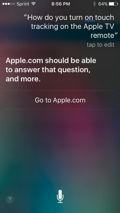
The Apple TV remote apparently underwent a change in the most recent update. Used to be that you could just touch the Apple TV remote's trackpad, and you started tracking. Not so any longer. That just pops up a little hint that if you fully click the pad you'll jump forward or back 10 seconds, depending on where your finger is. Annoying. I couldn't find a quick workaround, so I was telling Siri, "Fast forward 15 minutes," and "Rewind 20 mins". What a freaking pain.
They set me up with a phone call, which is to say they routed me to a web page where I set up a phone call. The call went well, actually. Tara (?) knew exactly what I was talking about, and had had the same think happen to her with her Apple TV. "I am in Netflix, in case that matters." "No, what do you think I'm doing when I get home? Exactly that." The answer was to pause what you're watching. Then, and only then, will you be able to use the "Touch Surface Tracking". Anyhow, long story a touch shorter, check out the spacing in this survey form I was sent to fill out the next day: Wow. Just wow.[1] Check out that "Next" button down at the bottom. Do designers not get to use this on 27" iMacs? I mean, I like things that work on lowest common denominator, but shouldn't somebody test in a larger monitor? Finding the culprit wasn't too difficult. See that hard-coded Ouch. That's not what you want. Just change those two to 200 and 180 and you get... I know, I know, now there's the chance that some pages are taller than others. You can either make the original pane as large as you need for your busiest screen (not great, unless you're careful with how big the UI gets or scroll for questions that are exceptionally long), or you could just move the Next and Submit buttons to the top of the page and let it bounce from frame to frame. You can argue that these two alternatives are wrong for whatever reason, and I'm sure there's a better option, but it'd be hard to argue what they have right now is right. Ouch. I mean, I know they have good people at Apple. I recall looking at the source in iCloud once to see how they were doing their calendar and seeing a hidden job advert with an ASCII art cloud with a smiley face in it. Now it looks like they're removed it, but that's a cute touch, and the web version of Calendar is actually pretty good. Ask me, I'd know. If I'd been willing to move to CA right now, I would've applied. [1] Yes, this from a guy whose blog has been hard-coded to 600px seemingly since the invent of the Internet. posted by ruffin at 4/06/2016 12:07:00 PM |
|
|
| |


|
All posts can be accessed here: Just the last year o' posts: |
|||||||||||||||||||||
|
||||||||||||||||||||||
|
|
|
|
About Our Author