One feller's views on the state of everyday computer science & its application (and now, OTHER STUFF) who isn't rich enough to shell out for www.myfreakinfirst-andlast-name.com
Using 89% of the same design the blog had in 2001.
FOR ENTERTAINMENT PURPOSES ONLY!!!
Back-up your data and, when you bike,
always wear white.
As an Amazon Associate, I earn from qualifying purchases. Affiliate links in green.
I was working in the evening, and everything on my Mac was in dark mode but kdiff3.
Some of that was due to macOS changing theme when it's late, so you could argue kdiff3, an old enough app that I didn't figure would or should have auto-theme detection for macOS, was right "half the time", and the bigger half [sic] at that, the half during working hours.
Still, I caught myself saying, "If it had a dark mode for kdiff3, I'd use it all the time over none."
Oh yeah? Turns out that, though it's not in settings in any super-accessible way, after a little googling, kdiff3 does, in fact, have dark mode.
You just edit your .kdiff3rc file with custom colors. Of course, right?
But how did I learn that? And how could I figure out which colors work together?
If you just want one simple, competent dark theme, the answers to those questions are easy to find.
Replace color lines from your ~/.kdiff3rc (ex on win: C:\Users\<name>\.kdiff3rc) file with the ones from dracula theme's .kdiff3rc
Restart Kdiff3
Boom! It's working
That's pretty cool. I like the attitude: Hey, here's the minimum you need to play with a dark theme -- dark theme table stakes, if you're into that whole Gruber vernacular -- and here it is for as many apps as possible. A perfect mvp.
Though .kdiff3rc files are kind of a pain. The values you want to change are these:
Looks like kdiff3 resaves your rc file when it closes and re-alphabatizes, which is an interesting choice. Three cheers for conformance, I guess. Usually a good thing.
It's not like it's perfect. After setting colors for the text areas, kdiff3's chrome is still very... chromey. Very heavy toolbars and footer. But it's an old (gtk?) app, so I'm not complaining.
I now have a fully competent dark theme for an old app nobody with any sense of the state of programming tools would expect to have quite this easily.
For the XR, we flip the script, and have two completely different shells with the same internals.
That’s essentially what we had with the SE. Point here is that this “shared design constraint” model is increasingly prevalent at Apple
I think we add one more point to this list…
Apple was surprised by SE sales, and wishes they’d charged more.
What needs to happen to charge more for a cheaper version of the same internals? Well, first, you can’t pitch it as a spiritual remake of a four year-old design. You have to pitch it as a new phone.
So we have…
Top of the line internals but in a cheaper phone (SE)
An excuse to charge more by using an updated design (MBP)
A purely aesthetic appeal for dollars with frivolous colors (5c)
It’s not a perfect parallel, but I think you see how Apple’s past clearly births this new .
Still, I for one thought it would sell very well; all indications are that Apple agreed, but it quickly became apparent that customers overwhelmingly preferred the iPhone 5S. Apple struggled to keep the latter in stock, having produced far too many 5Cs, and the model was quietly discontinued two years later….
The 5C’s failure, such that it was, showed that the iPhone had three distinct markets:
Customers who wanted the best possible phone. They bought the 5S.
Customers who wanted the prestige of owning the highest-status phone on the market. Heavily concentrated in China, they bought the gold 5S.
Customers who aspire to owning a top-of-the-line iPhone, but couldn’t afford one. They bought the 4S instead of the 5C.
I guess I’m wrongly biased from seeing tons of kids enjoy the 5c, sometimes even over a 5 or 5S. I’d guess the 5c failed largely because of the craptastic 8 gig storage on the lowest-end 5c. That’s simply not a useable phone.
But the argument that people want what I’d call “aspirational luxury” from their iPhone is an important point.
As I said about the SE, above – “Well, first, you can’t pitch it as a spiritual remake of a four year-old design.” – is exactly what we're saying here.
If colors didn’t sell, the XR wouldn’t use them. Though maybe I should’ve substituted iMac for 5c?!
More interesting in the most recent Stratechery update is the XR explanation, however:
There is, of course, the question of cannibalism: if the XR is so great, why spend $250 more on an XS, or $350 more for the giant XS Max?
This is where the iPhone X lesson matters. Last year’s iPhone 8 was a great phone too, with the same A11 processor as the iPhone X, a high quality LCD screen like the iPhone XR, and a premium aluminum-and-glass case (and 3D Touch!). It also had Touch ID and a more familiar interface, both arguably advantages in their own right, and the Plus size that so many people preferred.
It didn’t matter: [For] Apple’s best customers... price is a secondary concern.
Here's an interesting post on the SourceTree development blog about why they believe their changes to the UI in the last few years are better, and here's another than explains changes to the Windows client specifically.
I get the sentiment of some of the changes, like this one...
The Windows App always used tabs for navigating between open repositories, but we knew that those tabs weren’t quite right. The toolbar sat above everything else in the UI, but it only really belonged to the open repo (tab). We’ve swapped those panels so that tabs now live at the top of the hierarchy, much like browser experiences that you are no doubt familiar with.
... but I don't necessarily get the conclusions. You want to have a coherent design philosophy, like Material Design or Apple's User Interface Guidelines, sure. But I've never noticed tab placement to be a problem in SourceTree. I get that it's not a browser look, but also wonder why we need to standardize on browser behavior. Is overuse of tabs in Windows apps a convention in itself? Probably was. Do newer Windows users balk at that convention and prefer browser conventions? Maybe. I don't know. I didn't see a lot of A/B testing in the SourceTree articles.
What I do know is that I hate the flatness of the newer SourceTree. I also hate how spaced out each line for a checkin is. It's disorienting and not as info rich as the alternating colors version we had previously. I also dislike the icons in the toolbar. Before, the icons were colorful, but not distracting. Now they're as flat and non-descript as a Jony Ives' designed button on iOS 7.
Just for fun, I thought I'd ask if anyone else preferred the UI from back in 1.7. To my eyes, at least, it's much less fatiguing to take in at a glance than the flatness of more recent releases, with nice, though old-school, cues about where widgets start & stop. Sort of like having serifs in a font.
The colors are also more muted, giving information rather than everything demanding attention at once in an overly egalitarian fleet of brightness floating on a flat sea of white.
(I do kinda like that last line in the quote, above.)
But one of the neat things about their own blog posts is that they do seem to care what you think. In that first that I linked to, you could schedule a 1:1 with them to discuss what you thought about design. Let's just go ahead and say that's crazy customer attention. ;^) And they ask for community posts if you have an opinion, so I'm doing my part, I guess.
Makes you wonder, though.
How much attention and how much of a company's resources are put into UI where it's not useful?
How can you tell?
Do you embed metrics in your apps once they're released to measure real-world use?
Is real-world A/B testing enough?
I mean, Linux still hasn't taken over the desktop for vanilla PC users. Why is that? Just apps? I'm betting there's some UI roughness that's also a barrier to entry. Good enough [for functional use] isn't always good enough [to sell (or be eaten?) like hotcakes]. And it's specifically these kinds of changes... less information, buttons being moved to different spots... that are the microactions that make everyone's day to day that much less productive.
Today, I had to make up some quick wireframes for a possible freeware iOS app. I did a quick google to find a free wireframe tool, and boy, they're almost all pay to play, or not only are they pushing you to pay to play, the few free features are hidden behind a sign up you have to perform before downloading.
I did manage to find a decent one in wireframe.cc. Not heavy on the tooling -- I think it brags about being minimalist -- and there are a number of things you have to roll... yourself... every... time (like buttons, which are rects with rounded edges that you then drop a label on top of and move together later), but for free, it's very nice.
Here's an example of one screen from the insanely complicated (har har) UI I made.
(I'm helping a charity that distributes goods, and wants to ensure they haven't served anyone twice before everyone's been served, regardless of location. At the same time, we want to track an absolute minimum of information, and nothing that could be used as PII. So voila.)
I didn't see a way to use my own image, like a gear icon for settings, but for a mock-up, it's perfect. Quick and painless.
A video published on Tuesday allegedly shows Apple's "iPhone 8" in quality control testing —with a rear-mounted Touch ID sensor, despite most recent rumors discounting that possibility.
If you've been watching the rumor mills this year, you'd know Apple's had this option of last resort in their back pocket for a long time. What's important to learn is how much otherwise risky innovation this sort of back-up planning enables.
And if you have been not just watching, but watching closely, you've seen a pretty interesting narrative grow around this year's iPhone rumors. I actually do believe Apple was, until the last moment, trying to embed Touch ID in the screen. I'd also buy the rumor that at least one team at Apple was sweating bricks, worried the in-screen Touch ID was going to get the cut, and were scurrying to get it to work at scale.
The reason they could wait until the last minute was precisely because they had Touch ID on the back of the phone ready to go. If the only other option they were left with was retina scanning, Apple Pay could've been in trouble. Can you imagine if iRetinaScan 1.0 had a flaw? Now what happens to Apple Pay for those who shelled out for your latest phone? Do they simply lose access to Apple Pay, now that you couldn't keep it secure? If you thought AntennaGate was a big deal, wait until Retina-Apple-Pay-Gate.
I'm not saying Apple is excited about back of the phone Touch ID (if it's really going to be used -- I suppose even if this video is legit, Apple could spin up a few mock lines without releasing that design), but it's better than nothing. Now you can include retina scan as the primary access point but not bet the farm on it working.
I've been letting an idea for a post stew for a while about how Apple has been remaking hardware to fit in previously designed shells. The original iMac is a good example, as it went through a number of iterations before the shell changed.
Starting with the latest iPod touch refresh, however, I think we hit a new gear with hardware design. And with the iPhone 7S or 8 or whatever it'll become, now we're no longer putting, say, last generation's innards into a previously released case, but ensuring that we can use either option 1 or option 2 with the next generation's shell. We saw, for example, two winners in the latest MacBook Pro. The touch bar MacBook Pro and the MacBook Pro Escape are two completely different animals, as I mentioned last December. Who knows how many other designs were created for the same basic aluminum laptop that didn't get chosen.
My budding claim is that Apple's MO is now to finish the outer shell well before a final decision has been made on what precisely is going inside. And to swap the choice on insides at the last minute is no longer a big deal, giving Apple lots more room to experiment within a generation.
These different design needs are, to steal from Rumsfeld again, known unknowns. If you know you're down to 5 either-or decisions for insides, you can build an exterior that anticipates every combination of them. If there's no back of the phone Touch ID, there's probably a tiny bit of space between the silicon and case that goes unused, or is now used by a battery with a slightly different design. If there is a back of the phone Touch ID, the changes to the rest of the hardware aren't just minimal, they're already completely anticipated.
I'm going to bet this sort of "planning for known unknowns" is exactly what Apple's doing, and doing better than anyone.
The sheer volume of bugs, it seems, proves that rewriting code from scratch does not make for a better code base, it makes it worse. Old code doesn’t rust, it gets better, as bugs are fixed.
Someone should tell that to StackOverflow.
Oh, I know, I know. This is design, you say, not code as such. But riddle me this, Batman: Was anyone not using SO because of the design?
I'm going to hazard a guess that the code behind that menubar/toolbar was heavily refactored too. Could be wrong. Hope I'm wrong. Idk. But in either event, I'm not sure the old site's design had rusted.
If there's one often-overlooked feature in Windows that I really enjoy using, it's the "Cascade all windows" feature for the taskbar.
I've been told -- unprovoked, so you know it's bad -- that I tend to have a lot of windows open when I'm working. It's true. I do. And when it's time to clean them all up, it's nice not to have to declare "windows management bankruptcy" and close everything I have open in an app before closing it out.
To dodge this, you can hold down shift as you right-click a taskbar icon, and select the option from this menu:
Well, often you can do this and quickly go through whatever the app has open. What Chrome does is less than particularly helpful.
It's hard to see there, but you can't read any window titles other than the very first one. You can click the image to make it full-sized. What's displayed sort of gives you an idea of how much you're going to have to sift though, but it's otherwise not insanely helpful.
Here it is, up close.
I can tell my order has shipped in the front window, and how many tabs I have open in the other five, but that's it. Done.
Look at what Edge does.
It's a little hard to see the details in the picture, but you can get a feeling of how absolutely beautiful (and by "beautiful", like any good engineer, I mean "practical" and "useful") that is. I can see every window, every tab, every title. Now I can quickly hit the X at the top right to close any window I'm done using & that needs to go away.
Here's what Edge shows when "cascaded", zoomed in.
Being a good resident
Edge gets Windows. You might say you're not surprised, but what is surprising is how badly Chrome flubs it. I mean, I understand the, "They even use Material Design on iOS, man!" argument, but I'm not buying that doing so requires that you be a bad Windows resident.
Edge looks distinctly different from Internet Explorer, for instance. You've got plenty of leeway before you lose your design language, so to speak. And even though Apple, for instance, completely ignored all the good Windows resident requests with iTunes and WinSafari, two wrongs don't make a right.
In short, it's not that hard to push the titles up into all of that dead white space in Chrome.
Why not use that for displaying real information, even if there wasn't the option to cascade windows? And since there is, well, let's just say that it's a horribly efficient, beautiful thing when the title bar/browser tabs are done right.
A pro laptop released today should definitely have USB-C ports — mostly USB-C ports, even — but it should also have at least one USB-A port.
Including a port that’s still in extremely widespread use isn’t an admission of failure or holding onto the past — it’s making a pragmatic tradeoff for customers’ real-world needs. I worry when Apple falls on the wrong side of decisions like that, because it’s putting form (and profitability) over function.
...
But this is not how Apple thinks about transitions like this. They design for the future, and in doing so, they bring the future here faster. In the alternate universe where the new MacBook Pros ship with one USB-A port, the transition to ubiquitous USB-C peripherals and cables will happen at least a little slower.
See? Gruber's usually right on the Apple-aesthetic money. (But isn't it "more slowly"?)
I was going to reply to Marco's post myself to say something similar. If there's one thing that Jobsian-Apple (so any time before Jobs left, and anytime, up to & including now, after he returned) does better than anyone, it's follow this advice from The Great One:
“I skate to where the puck is going to be, not where it has been.”
--Wayne Gretzky
Marco's asking Apple to skate to where the puck has been. Bad advice.
Lots of things wrong with the Mac line-up. The desktops are fossils, and the new MacBook Pros are too expensive and easily argued to be underpowered, refusing to wholly make up for the desktop gaps. But in five years, when I might want 32 gigs of RAM, I'll definitely want USB-C ports. My current laptop doesn't have them, and that's already a pain when it comes to docking options.
Maybe we should take a second to consider what Apple expects you to connect to your ports:
Thunderbolt monitor 1 (includes power & ports)
Optional Thunderbolt monitor 2 (also includes ports)
A dock, if your monitors aren't enough -- or something they didn't think of.
Something else they didn't think of. (The "horn of a rabbit" port)
The third and fourth are really just favors Apple's paying to you already. You need a controller per monitor, and Apple's throwing in an extra port per controller.
External keyboard and mouse -- and headphones/AirPods -- are all supposed to be wireless in Apple-world now. If there's anything you're not attaching to your monitor or dock, what is it? If you're mobile, you don't need anything else (in Apple world) beyond the power supply. You have the best screen, keyboard, and trackpad available. USB-C thumb drives exist, and are often faster than the crap you're still shoving in your USB-A ports.
What are you missing?
There's really only one place you can ding them on ports, and that's that there's no USB-C to Lightning cable in the iPhone 7 box.
Every Mac user thought the end of ADB (and every PC user the parallel port!) was the end of the world. Anybody (other than Gruber -- no, really) using an ADB or parallel port device now?
(And does anyone really think Apple's doing USB-C for profit? What, are they making billions on adapters? Seriously, who is buying MBPs? Joe iPhone User? Probably not. And Jane Creative Pro knows Monoprice & friends has cheaper options. Plus, honestly, you know, I really don't mind the symmetry.)
OWC announces Thunderbolt 3 Dock with ports galore, returns functionality to new MacBook Pro
By AppleInsider StaffWednesday, November 02, 2016, 06:15 pm PT (09:15 pm ET)
Capitalizing on Apple's decision to go all in on Thunderbolt 3 with its latest MacBook Pro, aftermarket Mac specialist OWC is taking preorders for a 13-port breakout dock that restores expansion options lost with the new laptop design.
No, no it does not. These options weren't lost. Apple wants you to use a dock. This is what USB-C enables, for heaven's sake.
Do you need ethernet when you're away from your desk? How about digital audio out? Thunderbolt? DisplayPort? An additional USB-C port?
PCs are like trucks: While talking about the iPad and whether tablet devices are bound to replace the laptop, Jobs resorted to an analogy involving motor vehicles. “PCs are going to be like trucks. Less people will need them… This transformation is going to make some people uneasy. The PC has taken us a long way.”
“I think if you’re looking at a PC, why would you buy a PC anymore," Cook said.Granted, he's promoting theiPad Pro, which, with its all-new smart keyboard and pencil, is a laptop replacement in many cases. But one has to wonder what that means for Apple's Mac and MacBook categories, with which the company had good success in the lasttwo years.
Cook doesn't really care much, as long as Apple is stealing from itself. Speaking about the iPad mini, he said it "clearly created some cannibalization" but, as long as the company cannibalizes itself, it's "fine."
You see exactly where I'm going with this. Did Apple build a truck? Do they even care about trucks any more?
I think the quick answer is no. Let's check out the tech specs of the 13"...
To overextend the metaphor, none of these have a great engine or are rated for much payload in the bed. The engines start at 2.0 GHz dual-cores. That stinks. And it's $200 to get to 16 gigs of RAM. No, really. $200 for an additional 8 gigs of RAM! My new Lenovo ran me $64 to add 16.
Want 16 gigs of RAM and a 3.3 GHz (dual-core [sic]) processor? Minimum drop is $2300.
Want 16 gigs of RAM and a 2.9 GHz quad-core? Minimum drop is $2700.
Stretching the limits of a truck
Okay, fine. Apple wanted to build a really slick truck, price be damned. Let's look to the truck market for an analog. There have been some neat trucks that are more worried with going fast than carrying a load.
The 1978 Dodge "L'il Red Express" is one. From cheatsheet.com:
10. 1978-’79 Dodge L’il Red Express
By the late ’70s, the feds had all but broken up the party for muscle cars. But most of the new safety and emissions laws on the books were for “passenger vehicles under 6,000 GVR,” and with that, Chrysler found a glorious loophole. Introduced in 1978 as part of Mopar’s “Adult Toys” lineup (hey, it was the ’70s…), the Li’l Red Express was a stripped-down Sportsman pickup with massive side pipes, garish gold accents, an oak-accented step-side bed, and a free-breathing 360 cubic-inch V8 that could take the full-size pickup from zero to 60 in under seven seconds, and run the quarter mile in 14.7 seconds. It wasn’t just the fastest American vehicle to 100 miles per hour back in ’78 – Car and Driver had it out-accelerating the Porsche 928, 911 and Ferrari 308 too.
That's cool. It's a truck whose straight-ahead speed puts it into Porsche & Ferrari's class. Imagine taking off at a stop light in one of these with some idiot acting like they own the strip with their 308 or 911. (The Ferrari 308 is what Magnum drove, fwiw.)
Yet this isn't really a truck, is it? This Dodge is a muscle car in a truck skin. It exists only because, as CheatSheet.com pointed out elegantly, a "glorious loophole" existed. Detroit had cornered the market on go-fast, but also on gas guzzling and emissions madness. I drove an old 60s Olds 442 around a little, and you could watch the gas needle move noticeably downwards as you drove. Smells great, goes fast, but wow. Not OPEC-independence friendly. When the government discovered emissions control was important, where could that go-fast knowlege go?
Dodge was great at muscle cars, so great that it got to the point it couldn't stop making them. It took a truck off the assembly line and turned it into something else. Okay, I'm stretching the metaphor waaay too far, but you get where I'm going.
If you want to buy a truck for your landscaping business, these are insanely overpriced, and spend a lot of money doing things you don't need them to do. The Dodge isn't a failure because it actually goes fast. But it's no longer doing the job of a truck. More to the point, this Dodge is for muscle car buyers, not truck buyers.
But don't she look good?!
I can kind of hear Schiller now claiming that the new MacBook Pro is so small. Look, it's thinner and weighs the same as a MacBook Air. Um, wow. I never had much trouble lugging around my PowerBook 150. Why do I care?
And you know what else looked cool when it was released?
As the North American International Auto Show kicks off in Detroit, TIME and Dan Neil, Pulitzer Prize-winning automotive critic and syndicated columnist for theLos Angeles Times, look at the greatest lemons of the automotive industry
2004 Chevy SSR
William Thomas Cain / Getty
It's surprising, considering that Chrysler and GM are in the same town, that GM didn't learn from the Plymouth Prowler episode. When GM decided to kick up some custom retro mojo, it commissioned the Chevy SSR, an awesome-looking hotrod pickup truck with composite body panels and a slick convertible top. Alas, the chassis and mechanicals for the SSR were borrowed from GM's corporate midsize SUV program, making the putative performance machine heavy, underpowered and unforgivably lazy...
Here's a better look if that's not ringing any bells:
The SSR is a lot closer to what I see in the new MacBook Pro. It's not a truck at all, dang it, and what's more, it never was.* It might be svelte. But programmers and professionals, though they can be swayed by svelte (and have; look at all the Macs at press and professional conferences), still need to put payload in the back of their trucks. Like the SSR that, iirc, couldn't tow but 2500 lbs off of the lot, and couldn't carry that horribly much either.
The Chevy SSR was a truck for truck designers who wished they were designing sports cars. Now you've really gone meta. And gutted your potential market.
What a truck looks like...
If you've been reading for a while, you know I bought a Lenovo 14" Y700 back in April. And my initial review was fairly positive.
128 gigs of SSD + 1 TB of spinning platter storage
1080p screen
The keyboard I kinda fixed like this (it's an external keyboard -- see the USB cable coming out of the top):
That's a truck, folks.
Apple's not dumb, is it?
Of course, I should add a disclaimer: Perhaps this simply means I'm not in Apple's audience any more. I've been buying Macs because they were better at what I wanted to do since the LC. Maybe now, as a web and applications developer, I'm better off with a fast WinPC and a slow Mac, relegated mainly to iOS-compilation duty.
But let's at least admit this -- with the Touch Bar MacBook Pro, we've left Jobs' truck metaphor.
* Okay, okay, the SSR did have an SUV platform -- the Trailblazer. But the Trailblazer wasn't exactly a truck either.
Last week, Apple did it again, but for some reason, nearly everyone in Silicon Valley is confused about what just happened. I mean, I understand the confusion, but do people really think that the most significant announcement was the removal of the 3.5mm analog headphone jack? I mean, it was, but not for the reasons everyone’s [in a tizzy].
Apple doesn’t give [two shakes] about neckbeard hipsters who spent thousands of dollars on expensive audiophile gear that rely on 100-year-old technology to transmit audio signals. They’ll readily drop them faster than Trump drops facts to make an argument in a televised debate.
Apple is securing its future, and to do that, it must continue to shrink the physical distance between its products and its customers’ conceptions of self. The Apple ᴡᴀᴛᴄʜ came first, busting our sidekick supercomputer out of our pockets and onto our skin. Apple’s next move will put its products literally within earshot of our minds.
He then goes on to recap my Medium post on AirPods (not actually my post, I don't think, but exactly the same ideas, all the way to deriding businessmen who wore Jawbones), but wasted words, less direction, and better pictures.
Okay, wait. To add a new filter in FogBugz, I first have to choose "Edit Current Filter"...
... and then find the tiny "Save As" textbox by scrolling to the bottom of the page, which isn't visible by default on a 2560x1440 monitor?
When I googled up creating a new filter, I found this page, which had an encouraging section:
There are number of controls that will help you manipulate and manage your filters:
The Save control lets you save a filter with a name. After you have saved it, it appears in the Filters menu at the top of the screen. Saving a filter also saves which columns are selected, and the sort order. Additionally, once a filter is saved, you can share the filter with other FogBugz users.
No idea where that "control" is. When I searched for "save" there was no picture on that help page, nor was there anything other than the "Save As" in the edit filter page I've pictured, above.
I realize FogBugz is for technical users (and it didn't take me a really long time to find all of this), and perhaps I'm completely spacing on something obvious, but wow. Usability test much? I don't mind that it looks like crap, like something from the late 90s that's been "rewritten" to use ExtJS GUI widgets. Honestly, I don't. Who cares how pretty it is?
I was pulling my iPhone out of my pocket to plug in my headphones to listen while I work, and was annoyed with the time I was wasting.
You know what would be better? Wireless headphones. Duh.
You know what else helps me keep my phone in my pocket? The Apple watch. (Note: I don't own an Apple watch. Just a cheap mechanical one and an Ironman.)
Apple's really taking this digital hub thing seriously. I've never thought removing the headphone jack from the iPhone was crazy -- I didn't like the move, and have marveled at the headphone jack's longevity as a standard before, but I get it. If you invented a phone from scratch, would it have two ports that accept headphones or one?
I have to think Apple's removal of the jack and the close integration of the watch both point towards Apple hardware that's more digital hub than necessarily phone. If they can get the hub with internet connection in your watch, then poof, it's there.
Anyhow, the take home is that my wired headphones helped me see why Apple doesn't really care for folks using them. It's ugly. There are better ways to listen to your sound.
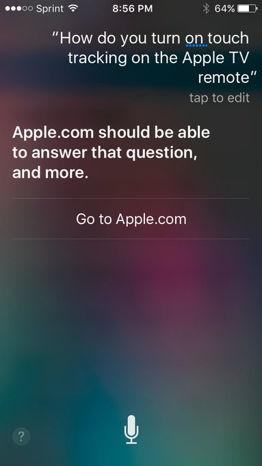
The Apple TV remote apparently underwent a change in the most recent update. Used to be that you could just touch the Apple TV remote's trackpad, and you started tracking. Not so any longer. That just pops up a little hint that if you fully click the pad you'll jump forward or back 10 seconds, depending on where your finger is.
Annoying. I couldn't find a quick workaround, so I was telling Siri, "Fast forward 15 minutes," and "Rewind 20 mins". What a freaking pain.
They set me up with a phone call, which is to say they routed me to a web page where I set up a phone call.
The call went well, actually. Tara (?) knew exactly what I was talking about, and had had the same think happen to her with her Apple TV. "I am in Netflix, in case that matters." "No, what do you think I'm doing when I get home? Exactly that."
The answer was to pause what you're watching. Then, and only then, will you be able to use the "Touch Surface Tracking".
Anyhow, long story a touch shorter, check out the spacing in this survey form I was sent to fill out the next day:
Wow. Just wow.[1] Check out that "Next" button down at the bottom. Do designers not get to use this on 27" iMacs? I mean, I like things that work on lowest common denominator, but shouldn't somebody test in a larger monitor?
Finding the culprit wasn't too difficult.
<div class="survey" id="survey" style="min-height: 1008px;">
<div class="surveybox">
<noscript>&lt;style&gt;html{display:none;}&lt;/style&gt;&lt;meta http-equiv="refresh" content="0; url=https://survey.apple.com/efm/survey?s=3D3148E443305DE208D35D82693FAEBF74&amp;jsrequired=1"&gt;</noscript>
<form name="PdcSurvey" action="https://survey.apple.com/efm/survey" onreset="return survey.OnReset();" onsubmit="return PdcProcessPage();" method="post" novalidate="">
<!--Q24_START-->
<div class="survey-content" style="min-height: 960;"><div id="Q24_WRAPPER" class="question essay">
<a class="anchor" name="A24" id="A24"></a><label class="question-text" for="Q24">What could we have done better to improve your AppleCare support experience?</label>
<div class="response-set">
...
See that hard-coded style="min-height: 1008px;"? If not, perhaps you found the style="min-height: 960px;" a few divs later?
Ouch. That's not what you want. Just change those two to 200 and 180 and you get...
I know, I know, now there's the chance that some pages are taller than others. You can either make the original pane as large as you need for your busiest screen (not great, unless you're careful with how big the UI gets or scroll for questions that are exceptionally long), or you could just move the Next and Submit buttons to the top of the page and let it bounce from frame to frame. You can argue that these two alternatives are wrong for whatever reason, and I'm sure there's a better option, but it'd be hard to argue what they have right now is right.
Ouch.
I mean, I know they have good people at Apple. I recall looking at the source in iCloud once to see how they were doing their calendar and seeing a hidden job advert with an ASCII art cloud with a smiley face in it. Now it looks like they're removed it, but that's a cute touch, and the web version of Calendar is actually pretty good. Ask me, I'd know. If I'd been willing to move to CA right now, I would've applied.
[1] Yes, this from a guy whose blog has been hard-coded to 600px seemingly since the invent of the Internet.
Castro and Unread provide variable height rows for episodes and article summaries respectively. This approach feels true to what Apple intends for iOS. Twitter clients like Tweetbot and Twitterrific do a great job here but unfortunately it's rare to see podcast or reader apps take this approach.
This is exactly the benefit of having an older app. They're arguing stuff like...
Have you ever noticed how many apps show their content in fixed-height rows? In these apps, text and images are cut off at the exact same interval, regardless of their intrinsic sizes. [sic on the lack o' question mark]
...
For our apps, instead of imposing a single cell height, we want to defer to the content by letting it tell us what size it needs. In Castro, episode cells include up to 4 lines of text if we have them, otherwise the cell collapses down to show the number of lines we do have.
That's what having a good foundation for your app already in placebuys you. There's no way I do that on my first cut a podcast app. ;^)
"Remember that nice young designer who worked at a big company — the one who wasn't invited to strategy meetings? By the time work got to him, the decisions were set down to the smallest details and all he did was execute. He wasn't designing. He was executing on someone else's design."
The company doesn't have to be big.
I do like that the very next thing in the post is an admission that this designer needs to be more assertive, but assertive isn't always the best career move if you're not confident enough to move on after encountering deaf ears, so I usually understand when new hires don't rock the boat -- for a while. But the Mule blog is right -- you should move on if you're not allowed to do your job. And if you know of someone who isn't being allowed to work, you as a coworker should feel responsible for helping make the space for them to do it. Be active. Culture change starts with you, etc etc. And if it doesn't or can't, *you're* in the wrong spot too.
Anyhow, sidelined there. Designers do get dumped on. Researching what the customer says they want, even coming up with general concepts that could become great features, doesn't make you a designer.
So google news has let me know about the new HP smartwatch, designed by Michael Bastian (whoever that is), and it looks sharp. The Apple watch seems to be, if anything, a little overdesigned. Long-term, that's probably a good thing for Apple. Part of the beauty of the iPhone, and what's allowed it to change the way all phones are made, was that it left buttons behind and allowed you to create any sort of app on the machine's small canvas. That is, no matter what sort of inside access you get, you can't do much with a Head-to-Head football game's controls. You might squeeze out a marginally different race car game or something, but you're basically stuck. When the screen is as wide open as a blank slate, you have lots more flexibility. The Apple watch seems ready to do things we haven't thought of yet.
But what do you really want from a smart watch? There are only two things everyone wants, I think. The time (if only for historical reasons), and a place to read timely message highlights. I imagine that, like me, everyone has their own third. Me, I want built-in GPS so I can track a run without carrying a phone around.
Oh, there probably is a third everyone wants: Don't look like a dork wearing a calculator watch from the 80s. Let's face it, having a calculator right there whenever you need it is really kinda neat, but only during those times when you need it. The rest of the time? Doooork-E. Kinda like a chunky square watch with an oversized crown would look now.
This HP watch dodges the calculator watch feel awfully well. It doesn't have traditional hands like iHands I was kinda hoping to see implemented well, but it's close. There's a dedicated watch section on the face at the top left, which gives a similar feel. Here's an image from Gilt.
So the "watch widget" ring and the tick marks are permanent, but the hands come from the admittedly not retina-quality screen. Also note the orange arrows I added, pointing at the edges of the square watch screen. That's a little cheap looking, though not quite as silly as black bottom bar on the Moto 360, but in a similar, "We botched the implementation," vein.
The permanent clock ring makes that square a little less obvious, which is at least clever. That should visually break up the feeling of the watch as a square screen shoved into a round hole/face, which is pretty important.
Ultimately, this is a much nicer looking watch than Apple's, at least speaking conventionally in 2014. Kicks the pants off of the Pebble. Always tells time. Battery lasts a decent while -- apparently around a week. And it gives you a nice way to check highlights of recent messages. I like it. Right now, I'd probably buy the Microsoft Band or a Garmin running watch instead, as they both have GPSes, natch, but if I was important enough that missing a message could be expensive and didn't want to look like I didn't realize fanny packs are supposed to be worn on your fanny,* this watch would have my attention.
*Btw, folks who don't seem to understand this simple truism -- that fanny packs are to be worn on your fanny -- really bother me. I don't even know if fanny packs are inherently dorky. They're insanely useful when you're hiking and don't want to carry a full pack, or need to get to part of your gear quickly and are wearing a high pack. It's not the accessibility that makes a fanny pack dorky. That, like a calculator watch when you actually need to double check some nontrivial math, is useful. It's the fact that you need to neurotically dip into the pack so often that you allow it to symbolically replace, well, you know, combined with the style faux pas of accentuating your belly, that causes our visceral reason to the dopes that wear fanny packs on their font side. STOP IT, for heaven's sake. ;^)
Remember, the design criteria of different languages are different, and therefore the decisions made are different. On the C# design team, we highly value a language definition which makes illegal patterns that look suspicious; since there's no meaning to passing an instance as the receiver to a static method (unless computing the receiver expression causes a side effect) then why allow the user to type meaningless code?
On the VB design team, they value the code working the way you meant it to work the the first time you typed it; if something looks a bit dodgy, maybe give a warning, but allow it and move on.
Just horrendously interesting. Though I still feel a little like VB.NET is just a compatibility layer draped over C# in practice, at least in theory I'm starting to believe the difference is more nuanced.
With taskbar on left, the problem is that you don't get more columns for new tabs when you drag the taskbar to the right, you just get longer tabs. This seems like a bug, or maybe it's a "feature" I don't understand...
When using taskbar on the bottom, I can get 20 tabs per row without scrolling kicking in, but have to manually drag the edge of the taskbar up to make more rows. I just had 60 separate tabs open, way more than I ever need...
He's right. It's driving me crazy.
Taskbar(s) on left:
Same icons open with taskbar at bottom.
Wow! I can see all the icons without scrolling! INCROYABLE.
Why can't I have the bottom taskbar functionality on the left? *sigh*
But then, if Microsoft, for heaven's sake, is taking shortcuts to get things out of the door, well, does anyone really write large pieces of great code?
The postings on this site are [usually] my own and do not necessarily reflect the views of any employer, past or present, or other entity. About Our Author